Project Overview
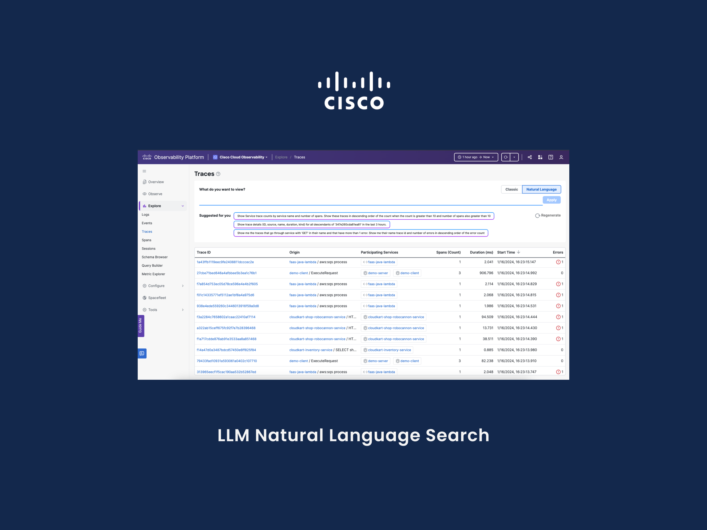
I led the end-to-end product management of Cisco’s Observability homepage redesign, focused on improving usability, feature discoverability, and access to contextual documentation. Through user research, competitive analysis, and close cross-functional collaboration, we launched a redesigned homepage that reduced user friction and increased engagement by 25% and feature adoption by 30%.
Role: Product Manager
Team: 15 cross-functional members including designers, engineers, researchers, QA, and domain PMs
Team: 15 cross-functional members including designers, engineers, researchers, QA, and domain PMs
Problem & Opportunity
As AppDynamics (Cisco) expanded its Observability platform to broader audiences, the homepage failed to guide users toward core features or help content, leading to poor discoverability and longer time-to-value.
Key Challenges:
• Users had difficulty navigating to important product areas from the homepage.
• Critical documentation and help resources were buried in secondary locations.
• Power users lacked personalization, such as saving frequently visited entities or dashboards.
Our goal was to make the homepage a more effective launch point—one that surfaced relevant content, quick-start resources, and user-specific shortcuts.
Target Users & Insights
I partnered with a user researcher to conduct interviews with:
• New users navigating the product for the first time
• Experienced users trying to resume their work across multiple sessions
I also engaged 5+ domain product managers to gather platform-level requirements and benchmarked competitor homepages for onboarding patterns and contextual guidance.
Strategy & Roadmap
To address these issues, I defined a focused product strategy for the homepage redesign, centered on two feature areas:
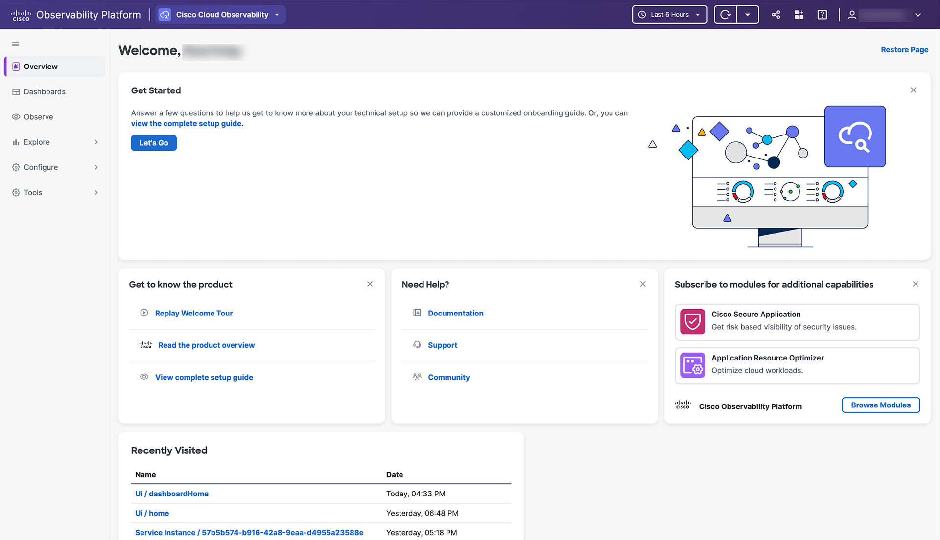
• Documentation Access – Surface contextual help content directly on the homepage
• Session Continuity – Enable users to resume workflows via a “Recently Visited” module
I worked with design and engineering to scope an MVP, prioritize high-value use cases, and ensure delivery on a tight timeline.
UX Design & Testing
I collaborated closely with designers to turn insights into prototypes and led usability testing to validate solutions and iterate on feedback.
Core Features Delivered:
• Documentation Widgets - embedded homepage tiles linking to critical help content (e.g., product tours, setup guides, support center) based on user type and behavior.
• Recently Visited - automatically surfaced pages and entities accessed during the user’s last session, enabling a faster return to high-priority work areas.
Engineering Execution & Trade-offs
Building a dynamic “Recently Visited” module across the product introduced engineering complexity. To deliver value quickly, I proposed focusing on high-impact modules first (e.g., dashboards and APM pages) while designing the architecture for future extensibility.
This phased approach allowed us to validate the feature with minimal risk and evolve it based on user engagement data.
Results & Impact
• 30% increase in feature adoption due to improved discoverability
• 25% increase in homepage engagement, as users returned and re-engaged with in-progress workflows
• Faster access to help resources, reducing setup and troubleshooting time
• Users reported that the homepage finally felt like a meaningful entry point into the platform—both for finding help and resuming tasks.
Key Learnings
• Surfacing help content contextually on the homepage can significantly improve user experience and onboarding efficiency.
• Preserving session continuity with “Recently Visited” makes enterprise tools more usable and user-friendly.
• A phased approach to technically complex features can accelerate delivery while minimizing risk.